______________________________________________________
I had the pleasure of working with this small business, where my employer originally created the logo. For this school project, I chose to redesign the identity to better reflect the femininity of the Côté Fleurs brand. Côté Fleurs primarily serves women aged 20 and older from middle-class households in Ottawa who value fresh flowers as a way to enhance their living spaces.
______________________________________________________

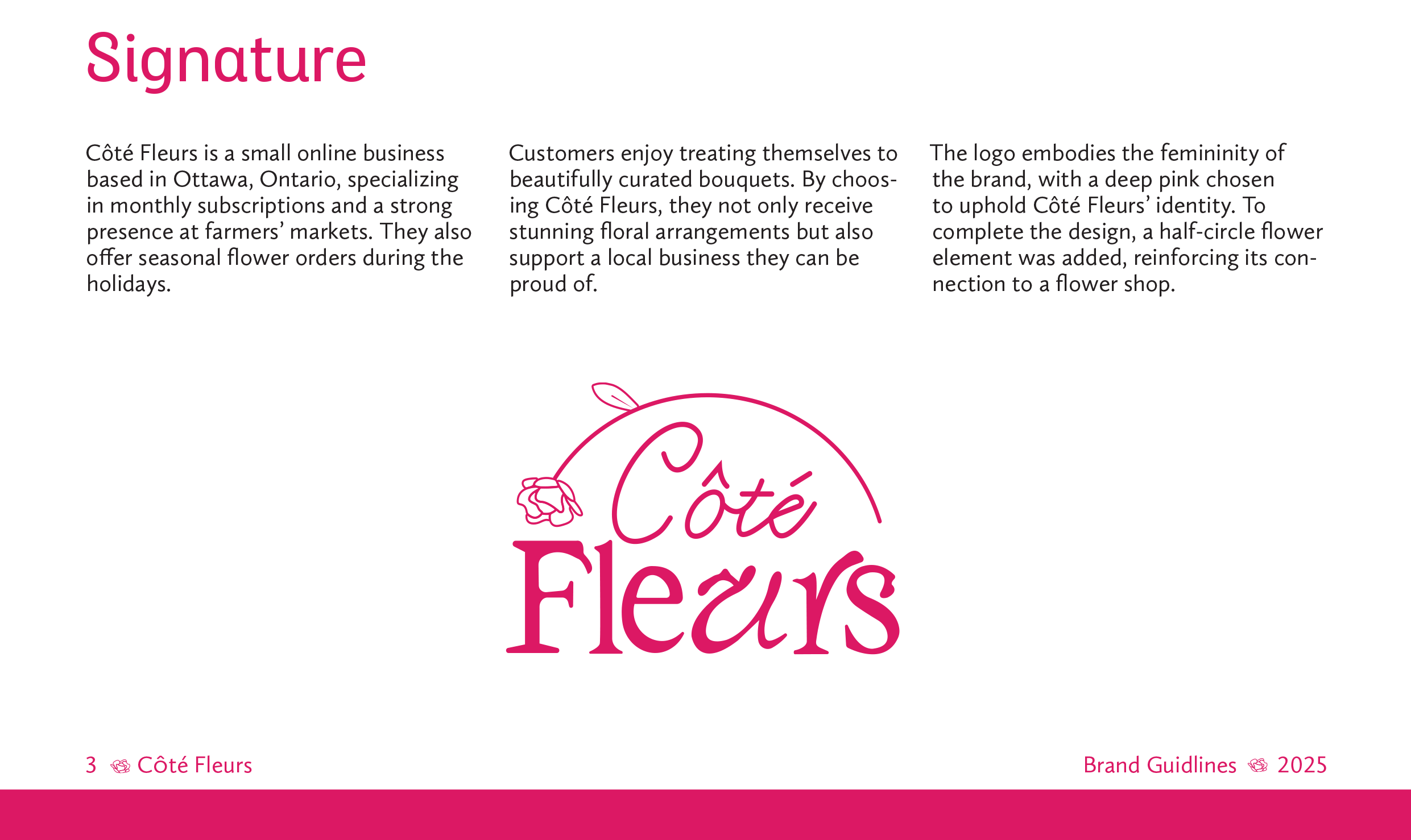
The redesign incorporates a floral element to clearly communicate the nature of the business to non-French speakers, without relying on text within the logo. The brand’s motto is to normalize “buying yourself flowers” and to make it a meaningful part of everyday life—one bouquet at a time.
______________________________________________________
______________________________________________________

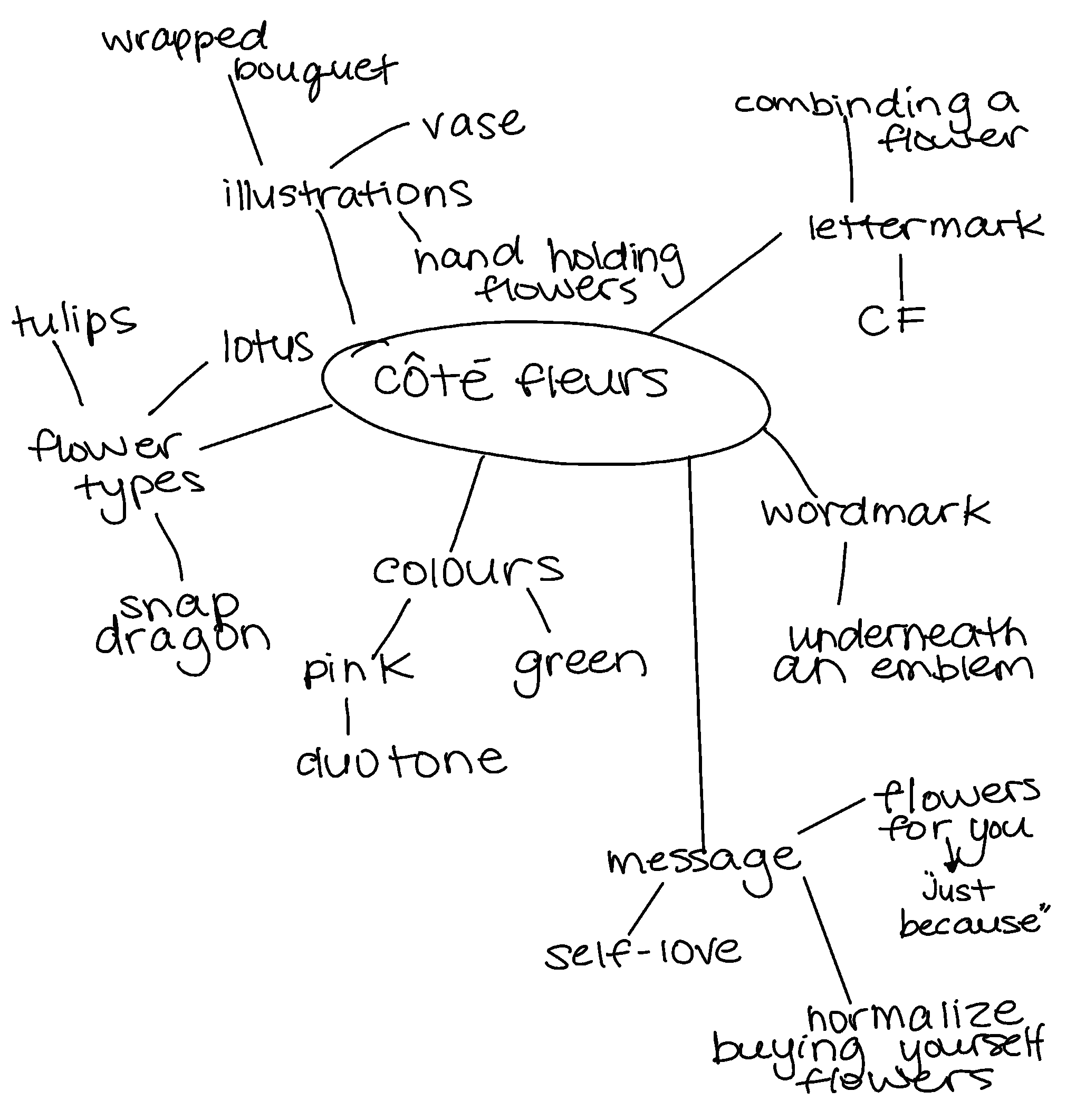
The owner consistently incorporates pink into her designs and often creates visual hierarchy by featuring one or two taller flowers, such as snapdragons. This approach strongly influenced the direction of there design, and I aimed to reflect these characteristics in a subtle and intentional way.
The goal was to maintain a feminine and delicate aesthetic while exploring both wordmark and monogram logo options. One of the project criteria required the brand name to be included within the logo, which guided the typographic and compositional decisions throughout the design process.
______________________________________________________

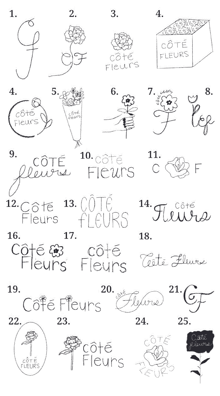
During the initial sketching phase, we were asked to create 25 quick concept sketches exploring possible directions for Côté Fleurs’ new branding. I focused on experimenting with typography, particularly cursive styles and connected letterforms, to reflect the brand’s elegant and feminine personality.
Throughout this phase, I asked myself several key questions: Should Côté be visually smaller than Fleurs? Could a monogram be integrated as floral elements, such as leaves or petals? Would the logo remain readable if the brand name were placed within a solid flower shape?
I was drawn most strongly to concept number 10 for its balance and clarity. However, concept number 21 also stood out for its elegance and refinement. The main challenge with that direction was finding a way to successfully incorporate the full wordmark while maintaining simplicity.
______________________________________________________

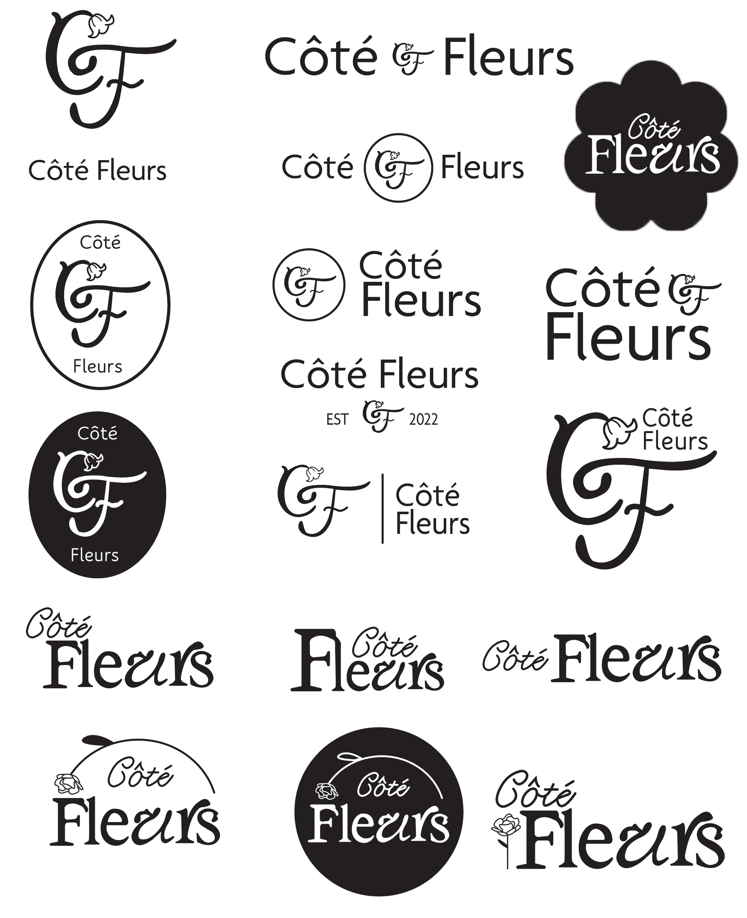
The next phase involved incorporating peer feedback and refining two selected concepts through further exploration and iteration. For the top concept, I developed the monogram direction inspired by sketch number 21. Based on feedback, I explored transforming the “C” into a floral form to strengthen the visual connection to the brand. To ensure the monogram stood out, I paired it with Agenda, a humanist sans-serif typeface that adds a friendly and approachable quality.
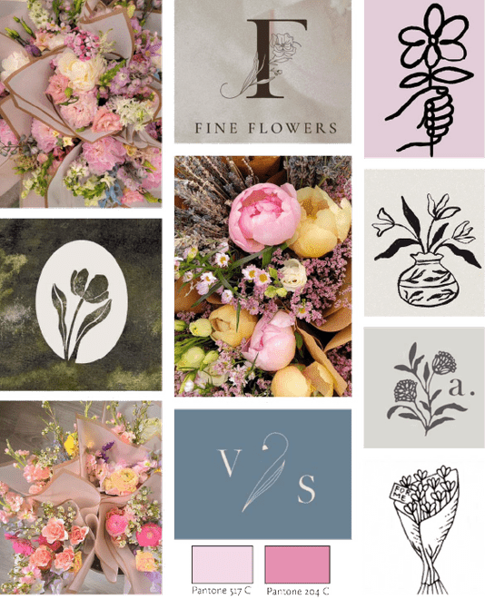
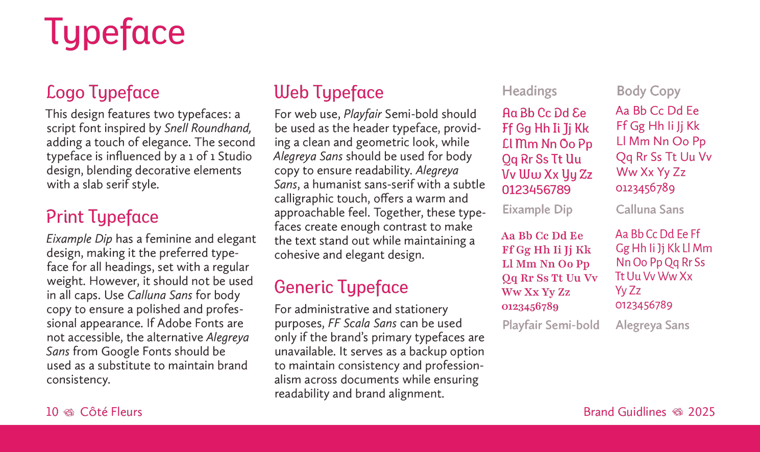
The lower concepts explore a typographic direction. “Côté” is inspired by Snell Roundhand, with additional visual references gathered fromPinterest and influenced by a 1 of 1 Studio design for the “Fleurs” lettering. I was particularly drawn to the decorative details and slab-serif-inspired forms, which helped emphasize hierarchy within the logo. This direction allowed me to further explore the balance between elegance and structure.

______________________________________________________

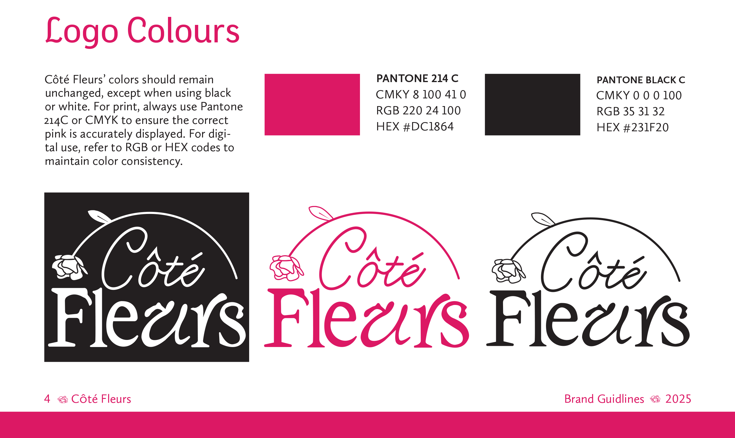
The color exploration phase is where the logo truly began to come to life. I remained consistent with the brand by working exclusively within a pink color palette, testing various combinations to determine which best supported the logo’s form and readability. Through this process, I found that one-color logo variations were the most effective and visually cohesive.
Lighter tones, such as Pantone 517, blended too closely with white backgrounds, while mid-range pinks like Pantone 1905 and Pantone 204 lacked sufficient contrast. Pantone 214, the darkest shade tested, proved to be the most successful, offering strong visibility while maintaining a feminine and refined feel.
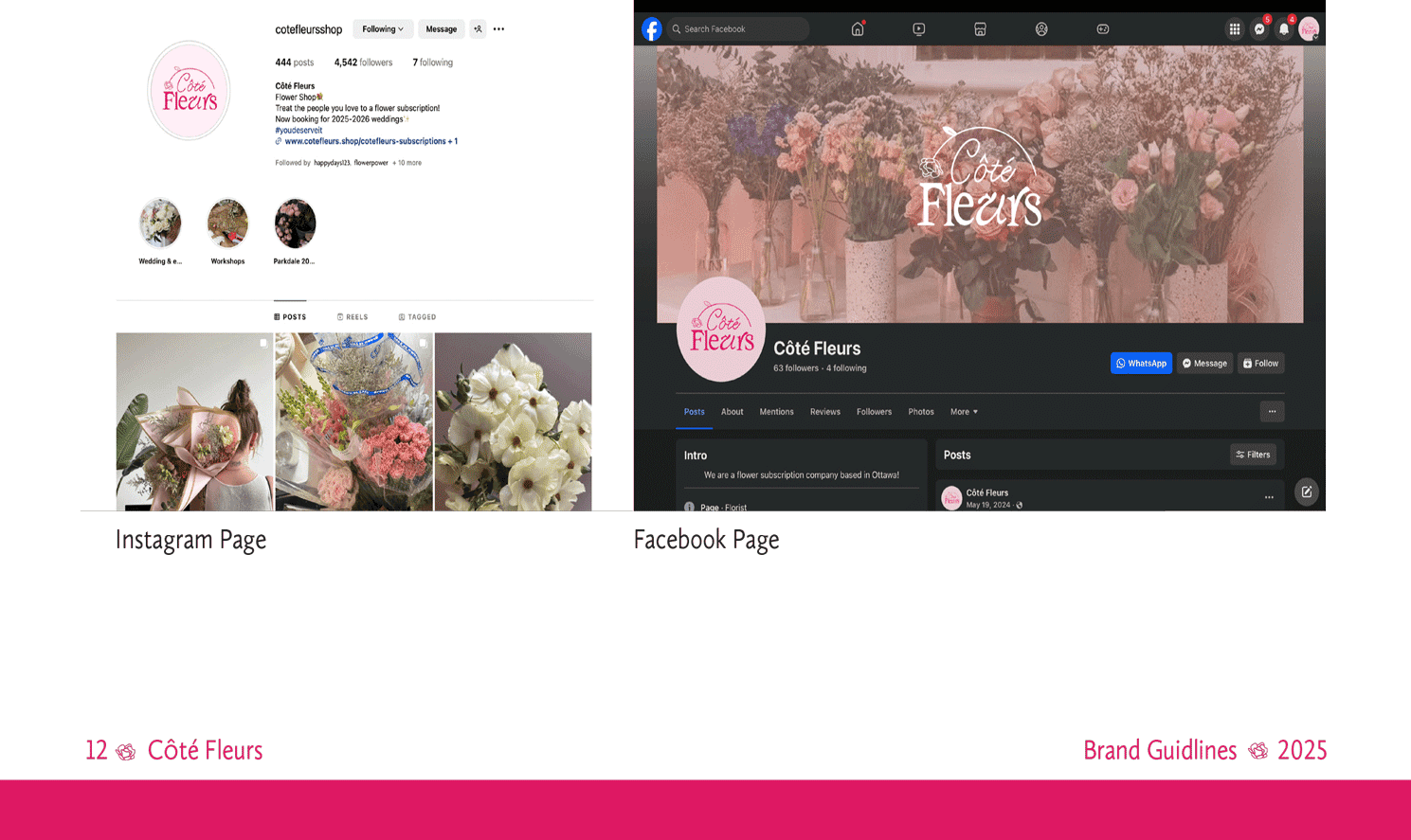
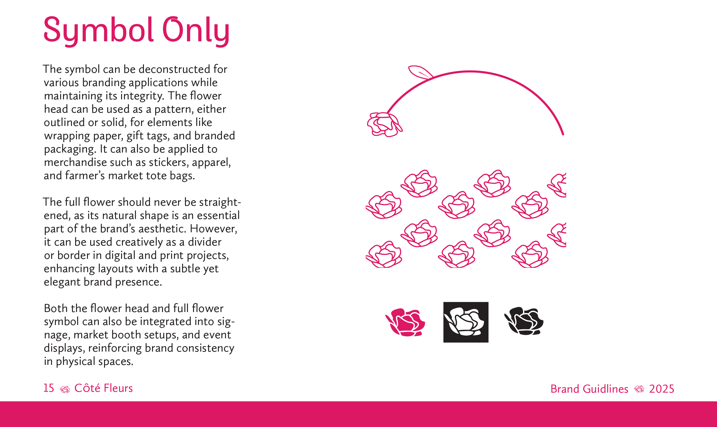
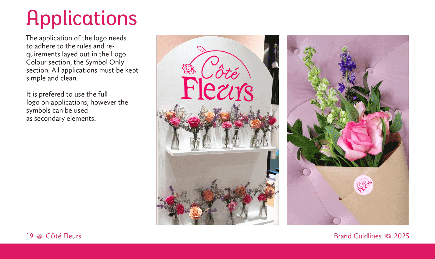
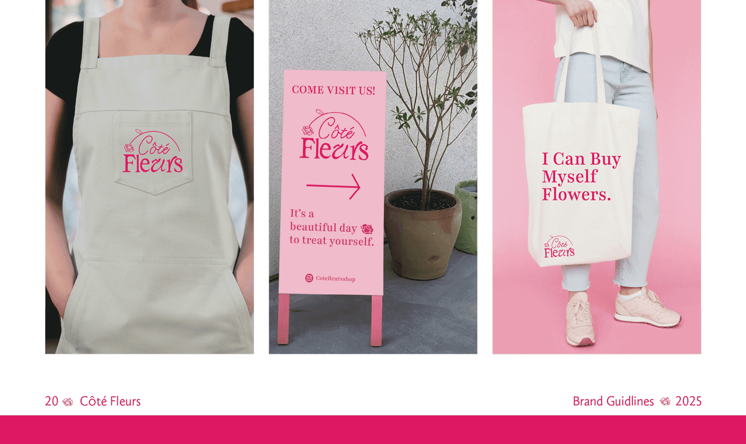
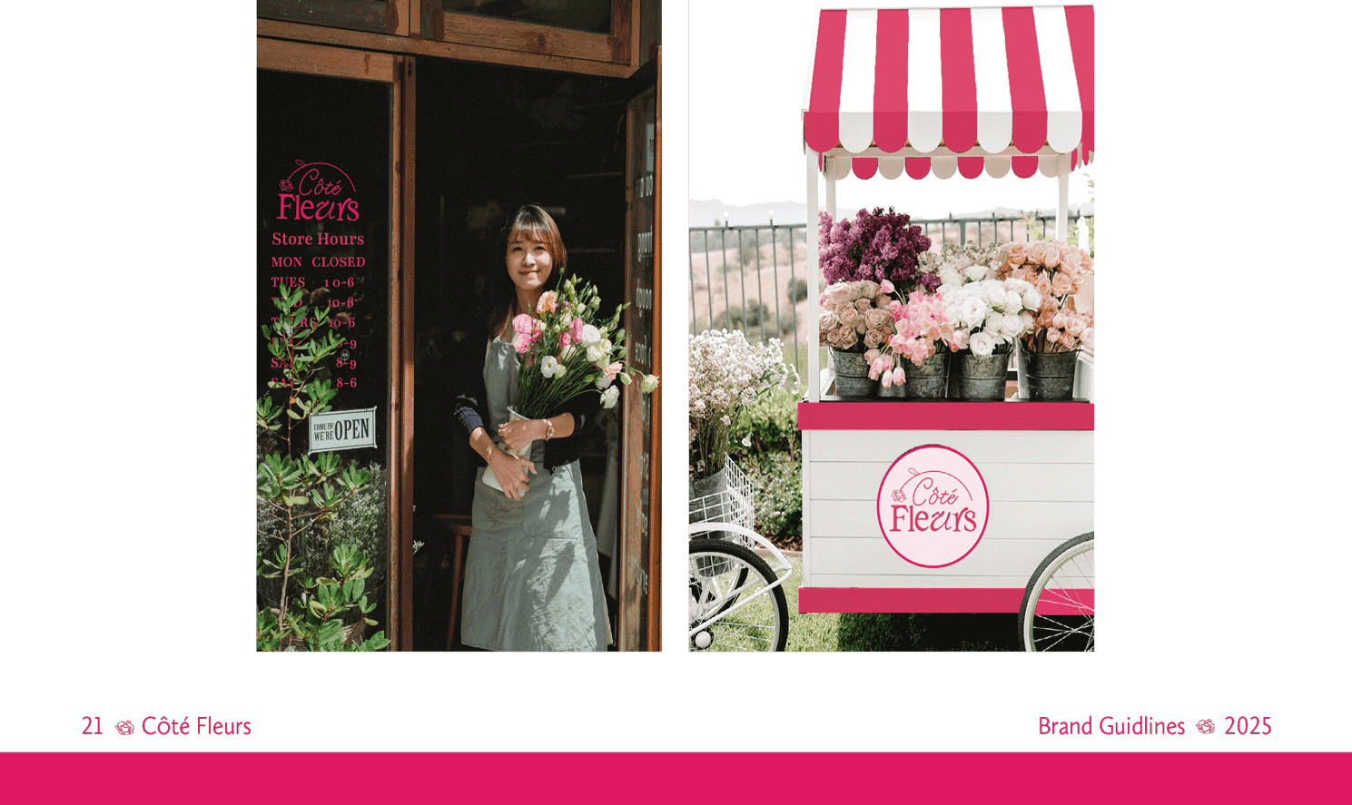
I ultimately selected the first concept for its versatility and potential for real-world applications. The circular composition works well across merchandise and storefront signage, and the three elements function together as a cohesive visual system. When used as a set, they create a strong, recognizable unit aligned with the brand’s identity and lifestyle-focused messaging.
______________________________________________________

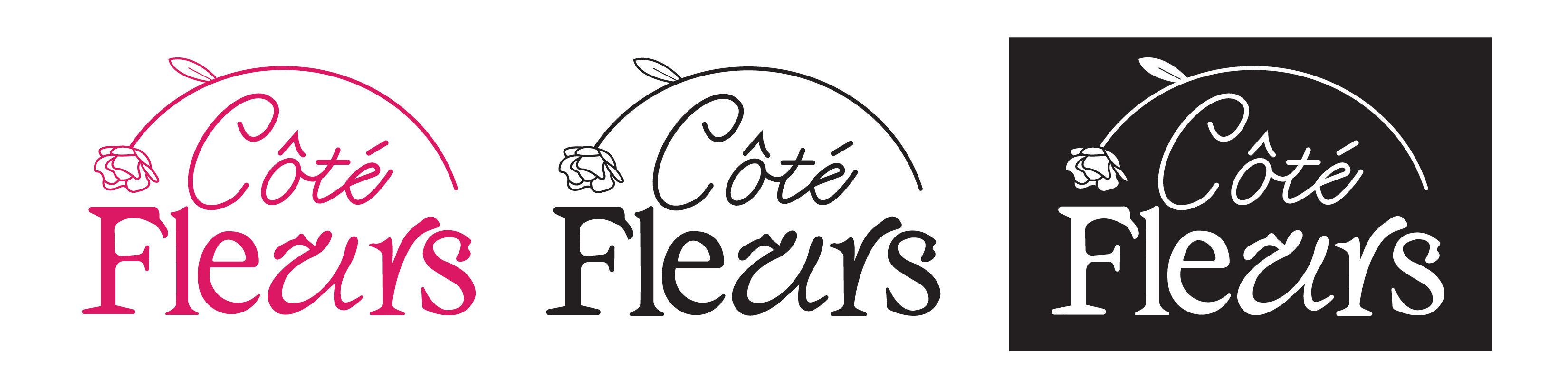
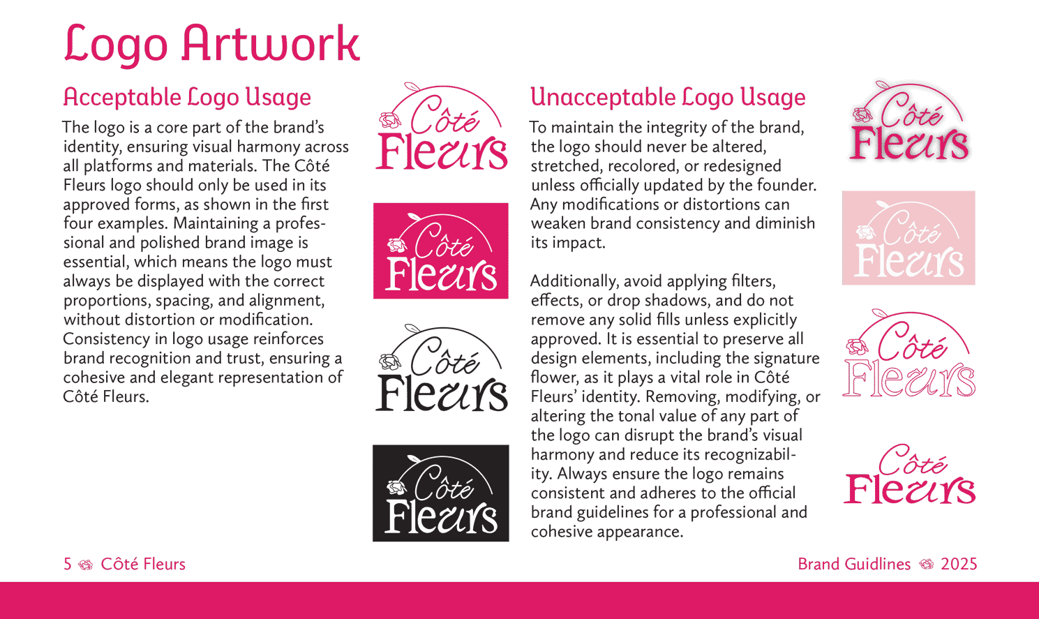
The final logo embodies the Côté Fleurs brand, capturing its femininity, target demographic, and signature floral hierarchy. The identity is versatile and performs strongly across applications, with the black, white, and reversed versions remaining clear and impactful. Overall, the design feels refined, cohesive, and true to the brand’s lifestyle-focused vision.
_________________________________________________________________________________________________________________
_________________________________________________________________________________________________________________
_________________________________________________________________________________________________________________
_________________________________________________________________________________________________________________
_________________________________________________________________________________________________________________
_________________________________________________________________________________________________________________
_________________________________________________________________________________________________________________
_________________________________________________________________________________________________________________
_________________________________________________________________________________________________________________
_________________________________________________________________________________________________________________
_________________________________________________________________________________________________________________
_________________________________________________________________________________________________________________
_________________________________________________________________________________________________________________
_________________________________________________________________________________________________________________
_________________________________________________________________________________________________________________
_________________________________________________________________________________________________________________
_________________________________________________________________________________________________________________
_________________________________________________________________________________________________________________
_________________________________________________________________________________________________________________
_________________________________________________________________________________________________________________
_________________________________________________________________________________________________________________
_________________________________________________________________________________________________________________