______________________________________________________
For this branding project, I focused exclusively on promoting Countryside Adventures’ winter activities. My goal was to explore creative possibilities in Adobe Photoshop while maintaining the brand’s warm, human-centered aesthetic by incorporating their own photography. The project required designing a variety of campaign materials, ranging from bus ads to web banners, all of which needed to feel cohesive and aligned with the brand identity. This allowed me to balance strategic branding with creative execution, ensuring a consistent look and feel across multiple platforms.
The goal of this project is to develop a comprehensive campaign for Countryside Adventures that demonstrates strategic and creative thinking in branding. I was tasked with conceptualizing a design that effectively communicates a message to the target audience while promoting the desired outcome. The project challenges me to generate original concepts, capture the audience’s attention through thoughtful messaging and design, and produce cohesive campaign materials across both digital and print mediums, all while adhering to campaign guidelines and constraints.
______________________________________________________
______________________________________________________
______________________________________________________
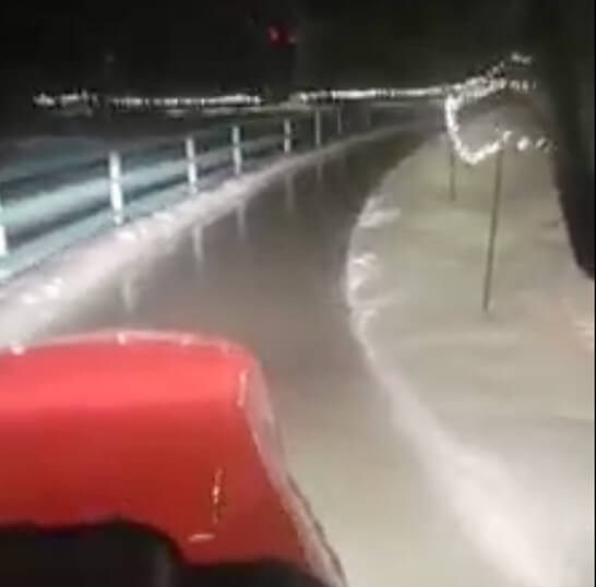
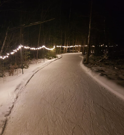
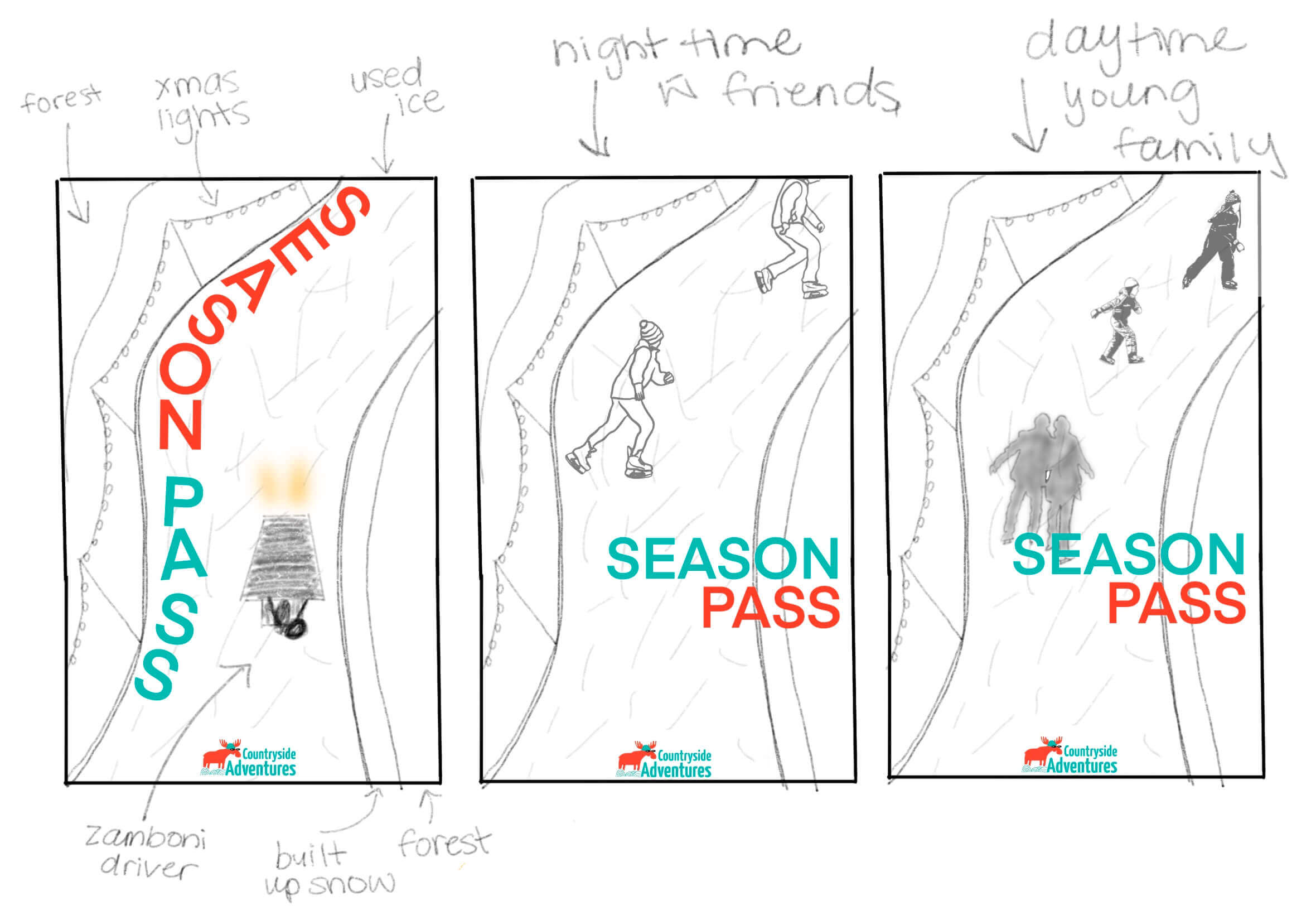
My first idea consisted of photos of their rink trail. I aimed to incorporate families and friends on the trail, experimenting with both nighttime and daytime settings. The colours stayed true to their brand identity while also incorporating natural tones.
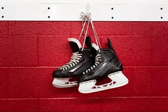
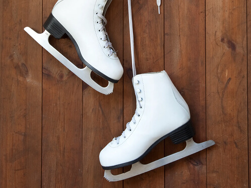
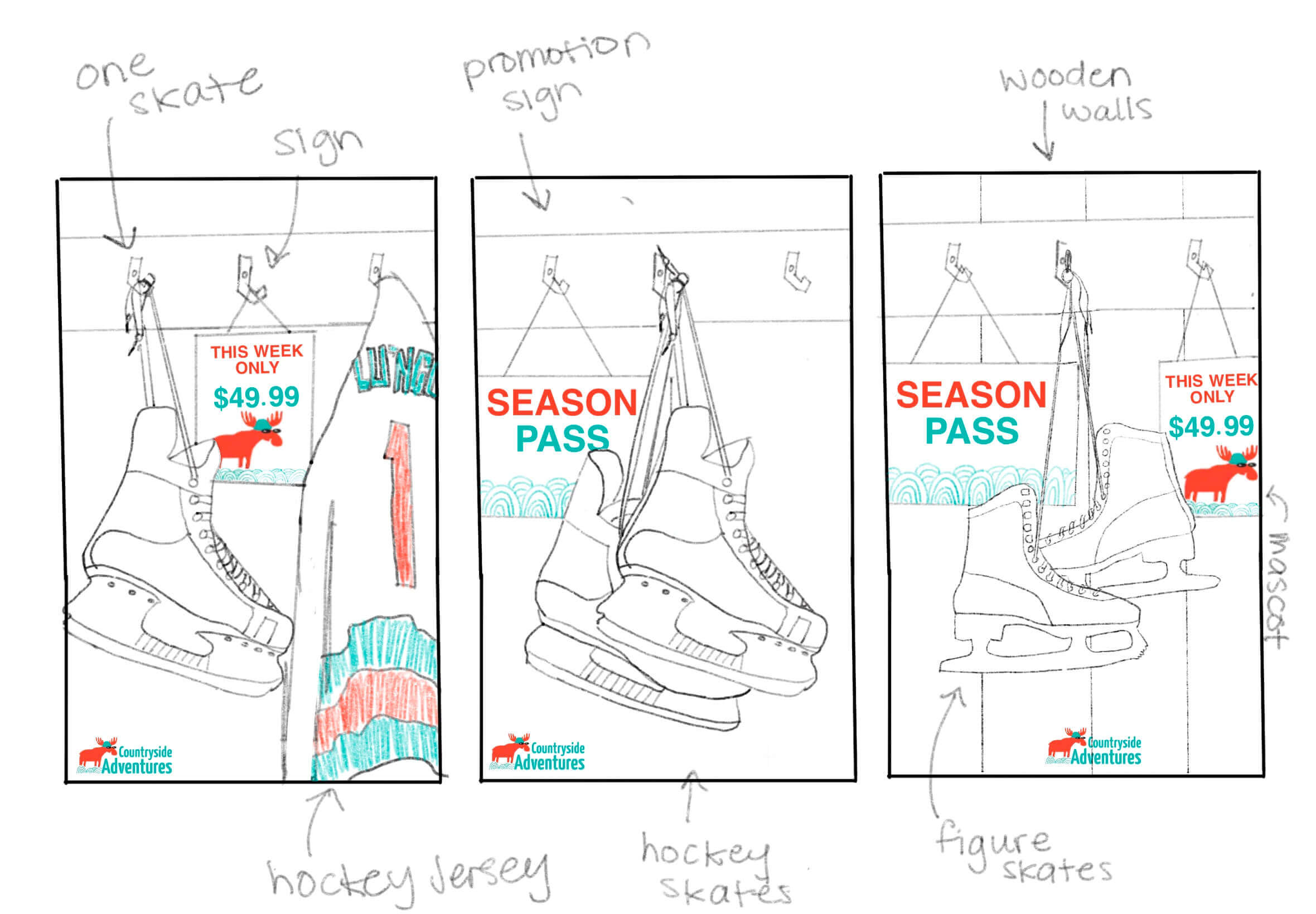
My second idea was set indoors where they keep the rental skates. I played with both figure and hockey skates, adding a promotional Season Pass sign behind them. I focused on creating a vintage theme for this concept while continuing to stay on brand by adding hints of their signature colours.
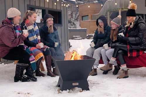
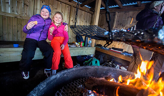
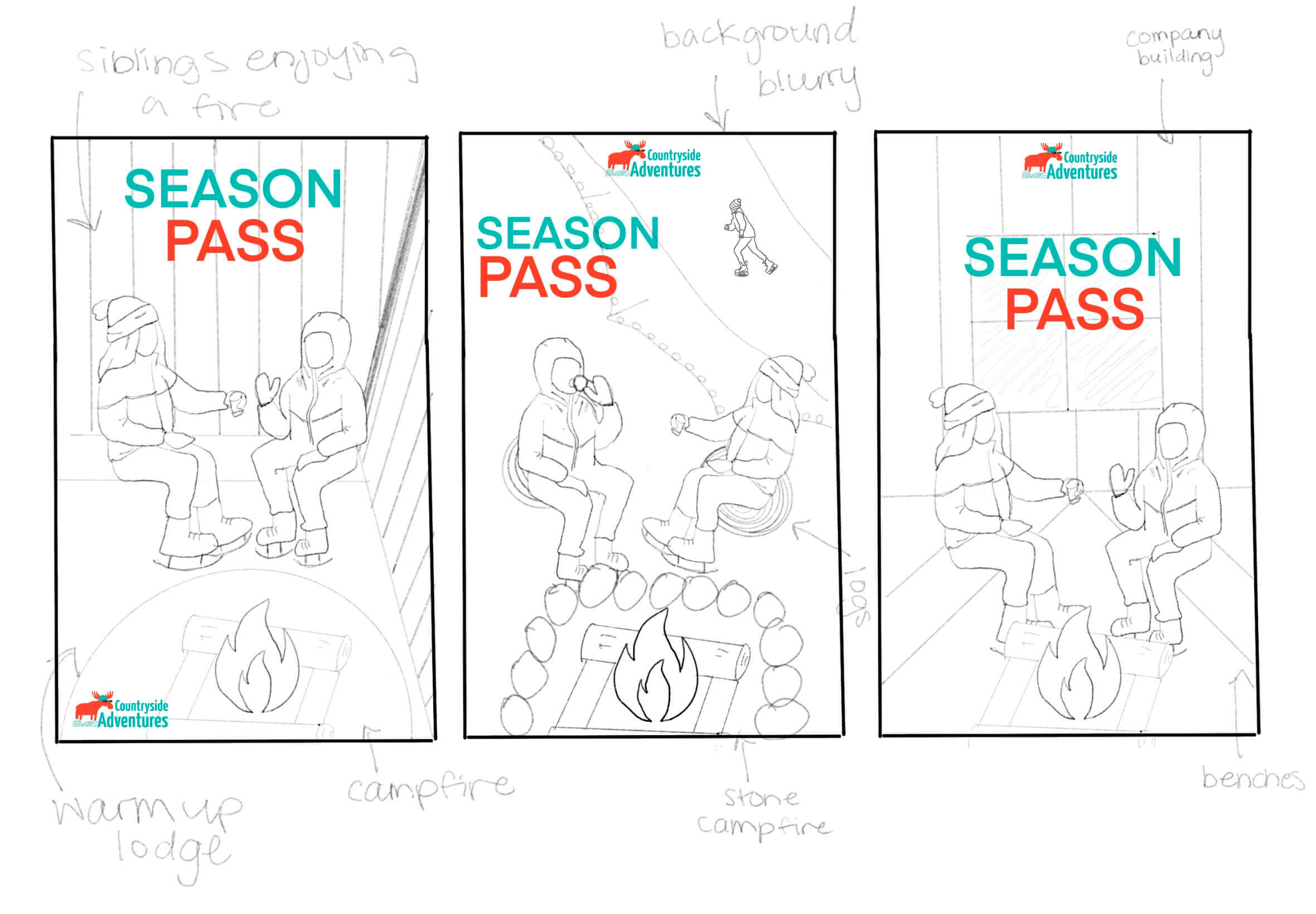
My last idea showcased an additional activity of sitting by the fire and enjoying a treat from their food truck outside. I kept the ad simple by featuring just two siblings and explored three different settings: inside the warm cabin area, outside by the trail, and next to their building.
______________________________________________________
______________________________________________________
______________________________________________________

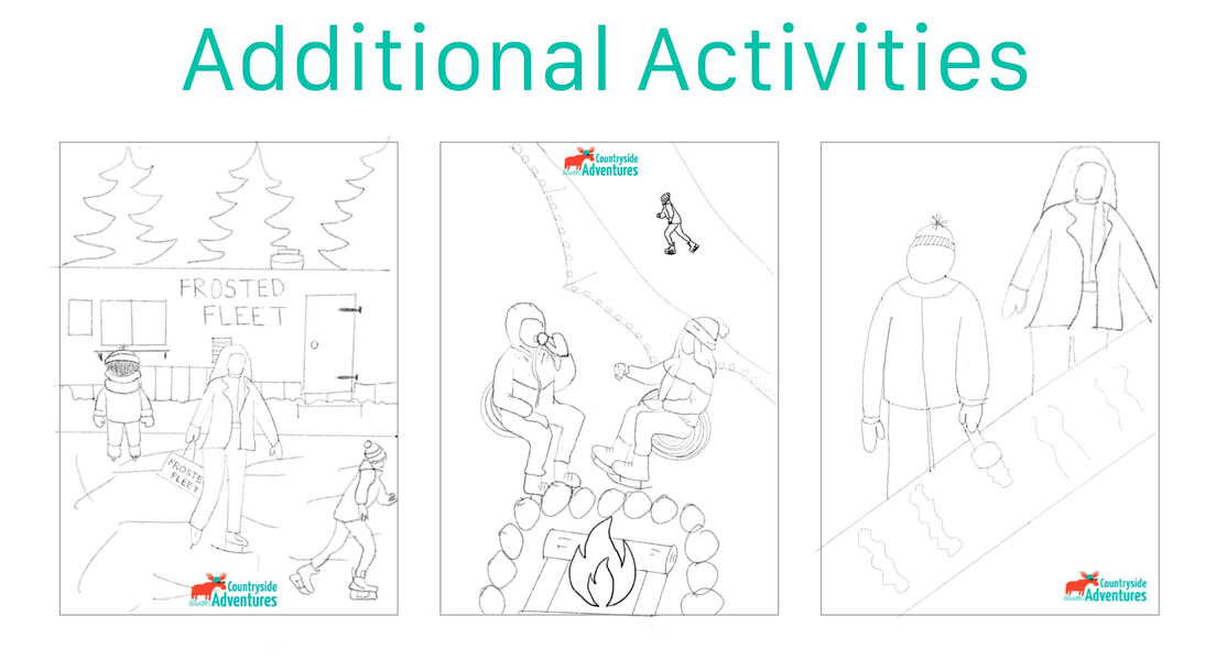
Displayed below are the first three concepts I developed. The first highlights the skating trail, featuring three different groups of people, from families to friends to the Zamboni driver, engaging with the experience. The second concept evokes a cozy locker room scene, with skates and jerseys hanging as part of the atmosphere. The third concept captures visitors enjoying warm drinks from the food truck, sitting by the fire while still wearing their skates, emphasizing the social and inviting aspects of the winter activities.
______________________________________________________
______________________________________________________
______________________________________________________

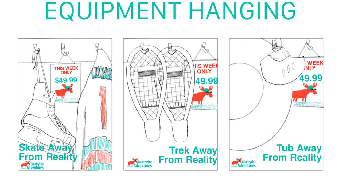
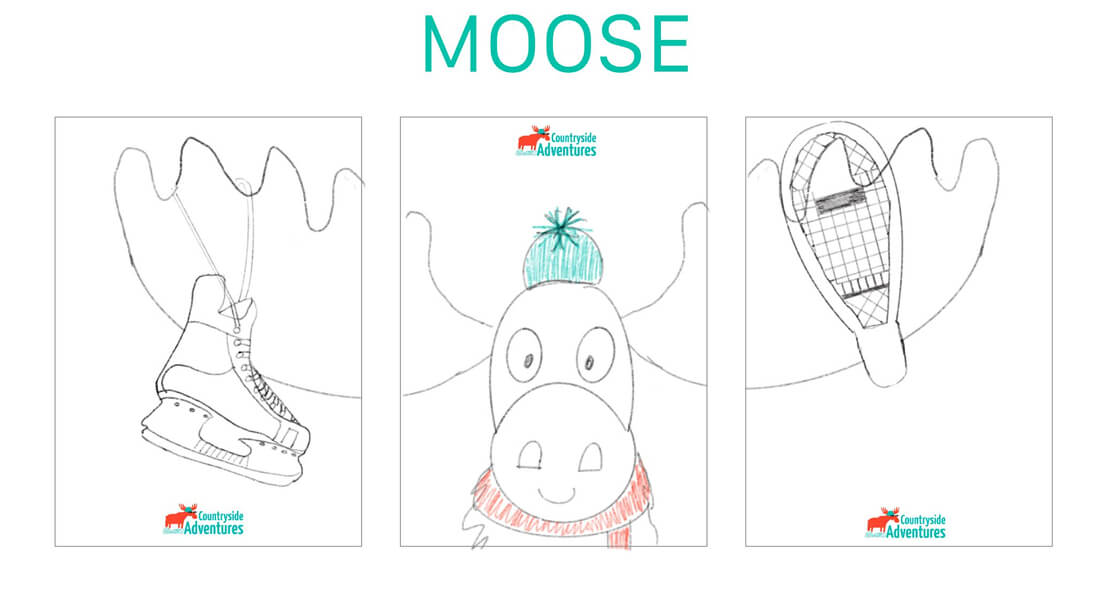
The first concept highlights the range of winter activities offered, represented through featured equipment. The second centers on the company’s mascot, the moose, with select equipment incorporated into its antlers. The third concept depicts visitors enjoying additional activities, including warm beverages from the food truck and maple syrup on a stick, and gathering around the fire still wearing their skates. Together, these elements emphasize the social, welcoming, and community-focused atmosphere of the winter experience.
______________________________________________________
______________________________________________________
______________________________________________________

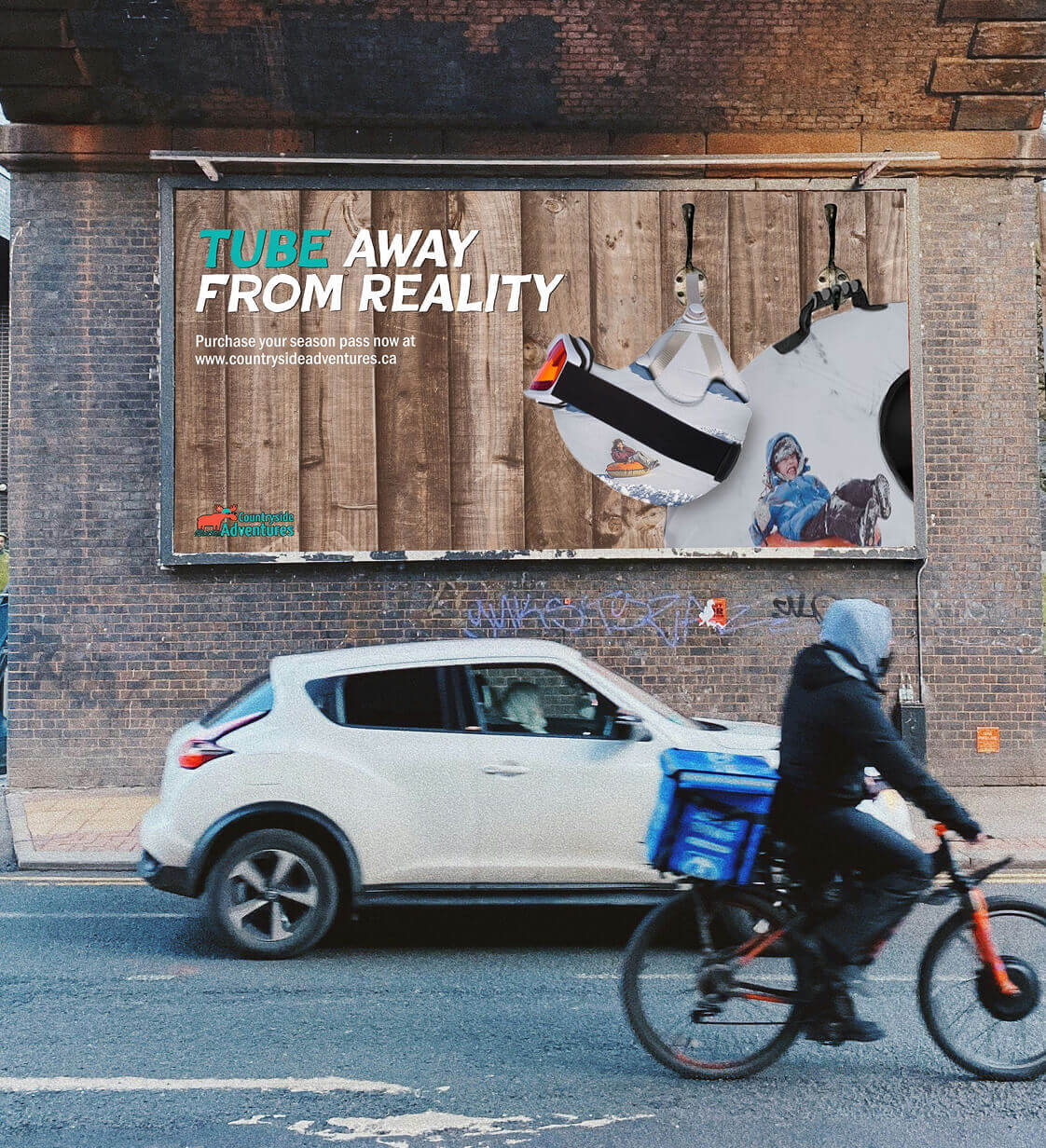
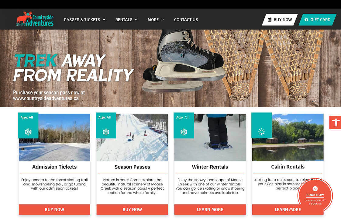
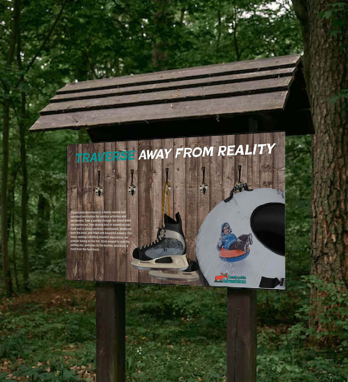
The sketches have been brought to life in these mock ups. In the skating and tubing equipment visuals, I incorporated images of customers to showcase the fun and engaging experience at Countryside Adventures. I ensured that the brand’s colors were present in elements such as customers’ jackets and ski goggles to maintain a cohesive visual identity. These mock ups also demonstrate how the advertisements will appear in real-world settings, providing a clear sense of the campaign’s impact in everyday contexts.


I faced challenges blending the photos together and making them appear as realistic as possible. Finding high-quality, free images of the equipment was difficult, which led me to get creative and photograph my own skates to bring my vision to life. Through this process, I deepened my skills in Photoshop, particularly using the levels feature to adjust brightness and achieve a cohesive look. If I were to refine the project, I would incorporate a solid color background beneath the text to improve readability and reduce visual clutter. Additionally, I would update the logo, as the available versions did not meet professional standards, likely due to the business being a family-owned operation. Overall, I am pleased with how the campaign turned out and the learning experience it provided.